CREATING A FUN VISUAL STYLE THAT BRINGS THE event's THEME TO LIFE.
When the Michigan Library Association (MLA) approached me about creating a the logo and look for their Annual Fall Conference (the biggest Michigan Library event of the year) I was thrilled to partner with them.
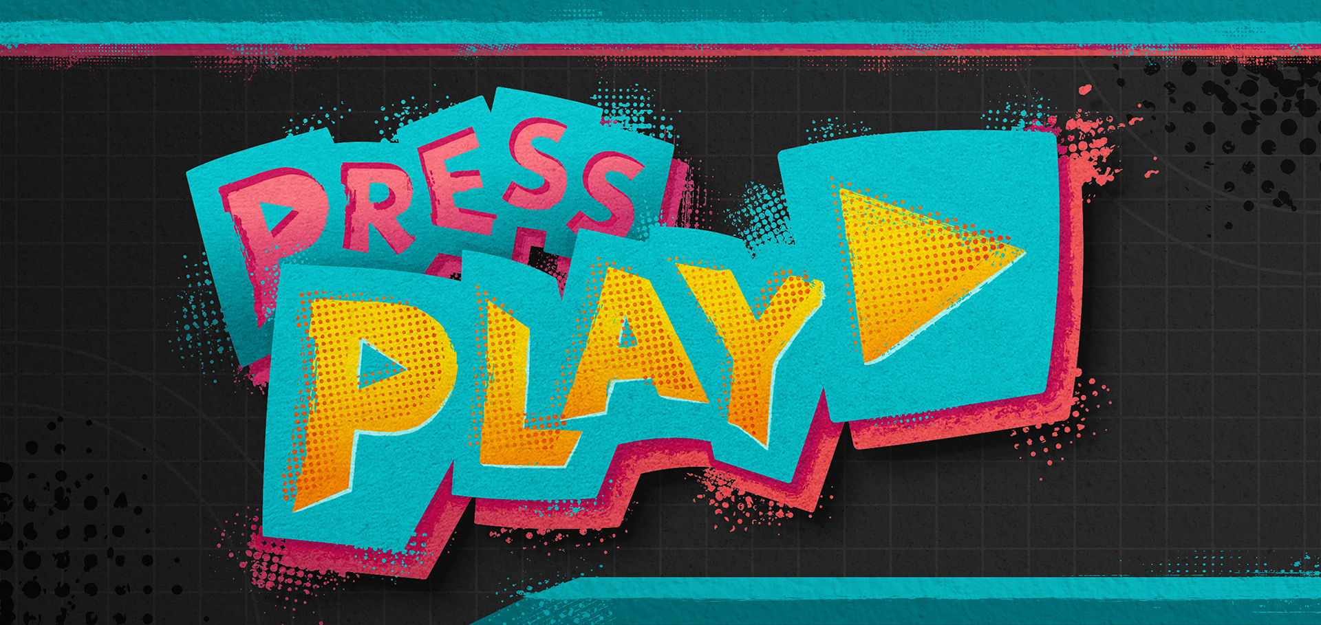
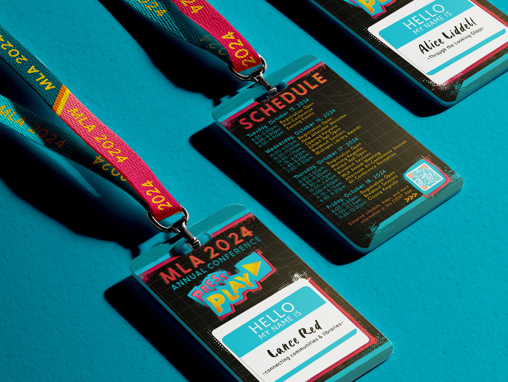
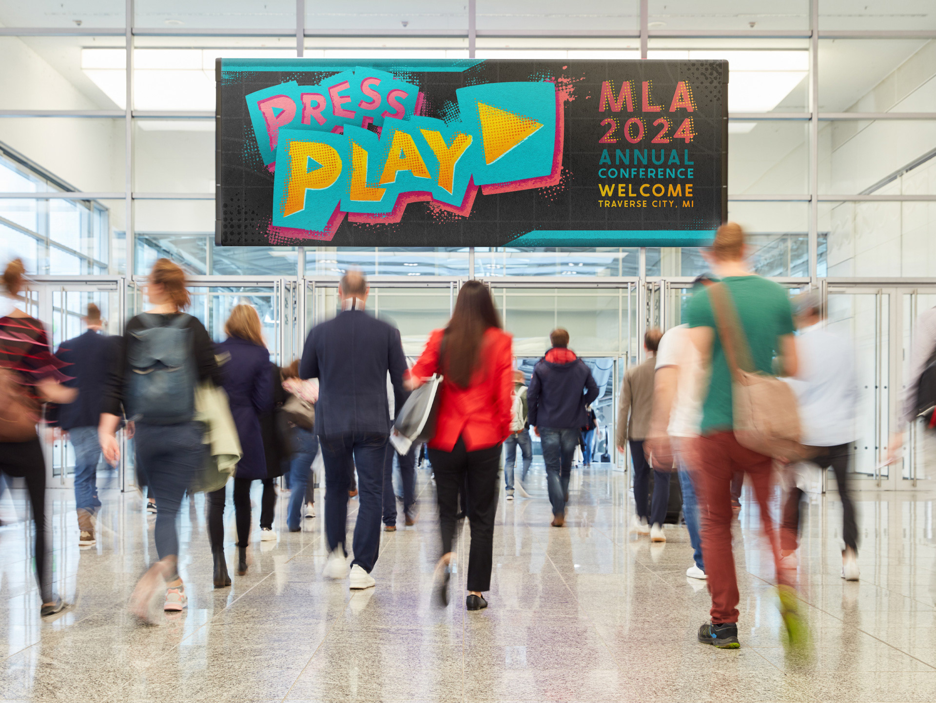
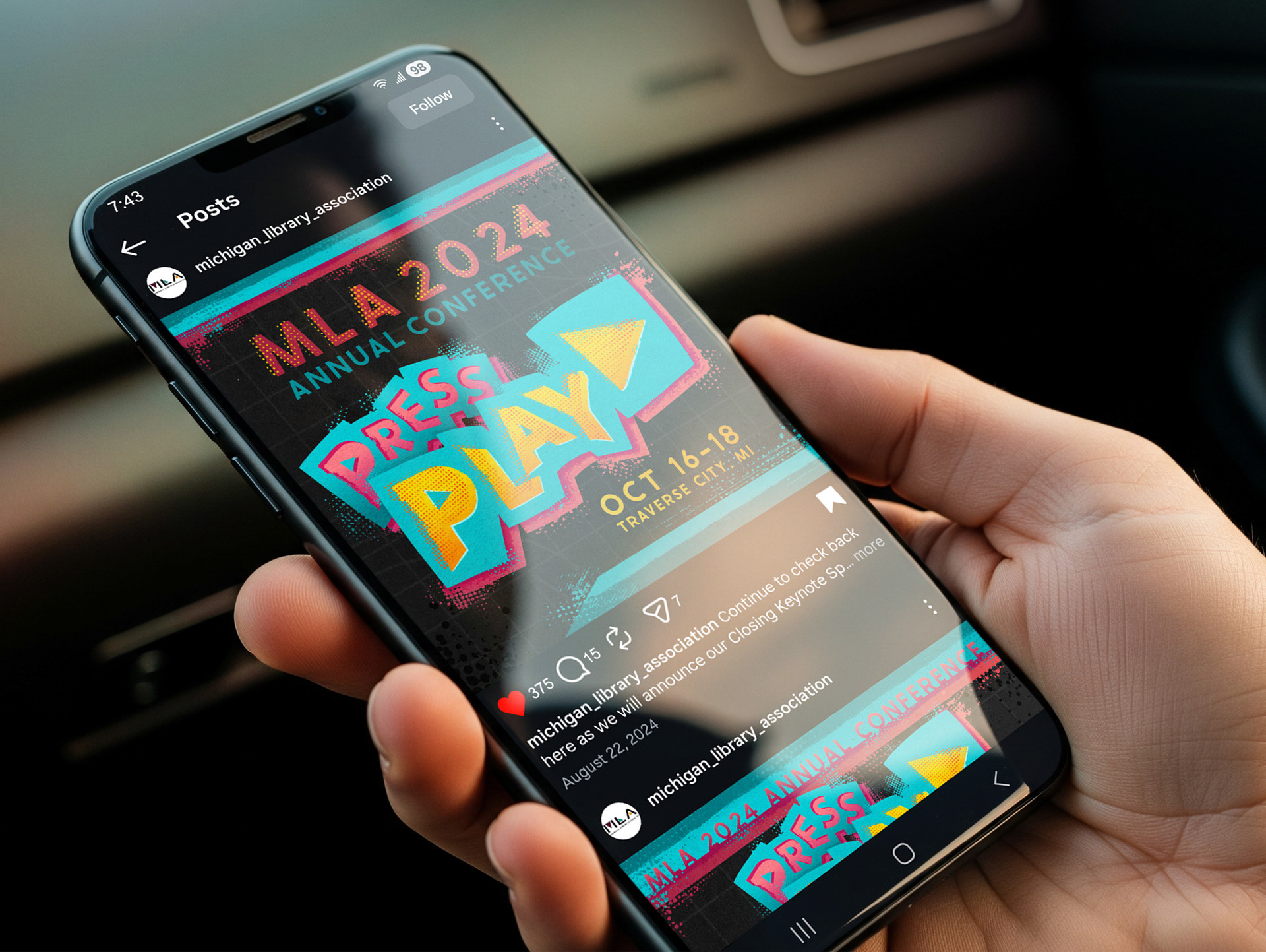
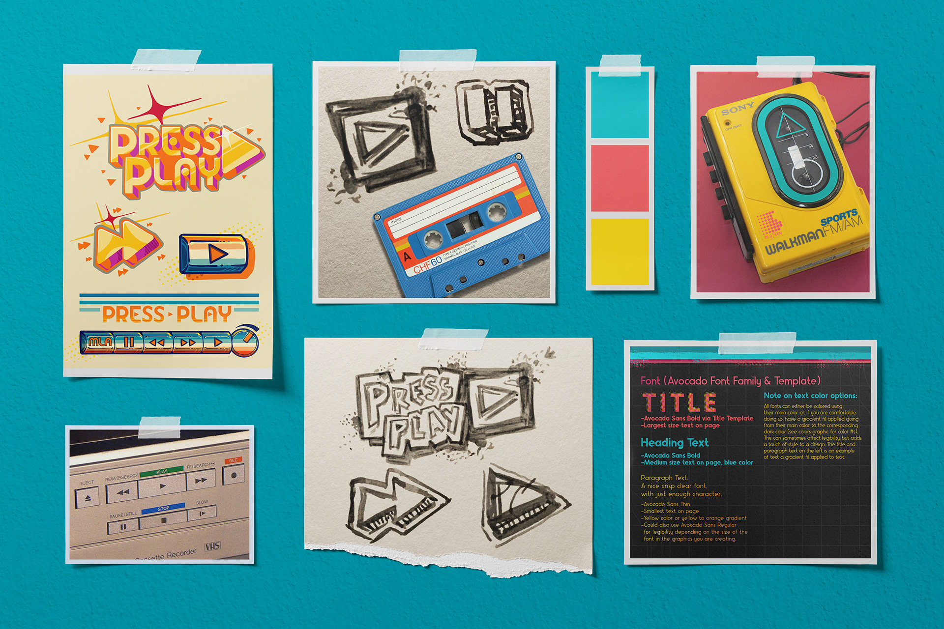
The theme they had chosen for this year was digital media playback, "Press Play" and they wanted something that incorporated the play button symbol. The challenge was to create the key logo, main banner, event badge, and then put together a brand kit I could hand off to their in-house designer who would then use this kit to create the rest of the marketing materials.
A Cohesive visual style that creates a more immersive experience for attendees.
This conference needed a visual identity that emodied its technology and future-oriented theme while also being somthing festive that elevated the conference from a business event to a library celebration.
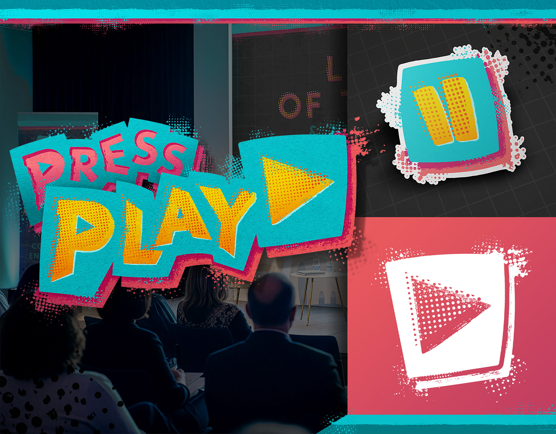
The grit of the texture adds just enough punk-rock feel to liven up the visuals and enhance the impact of the overall look. Having an exciting eye-catching brand style applied cohesively acorss all an event's marketing and communications helps to create a more memorable and enriching experience for attendees.
crafting memorable graphics to boost attendee entertainment.
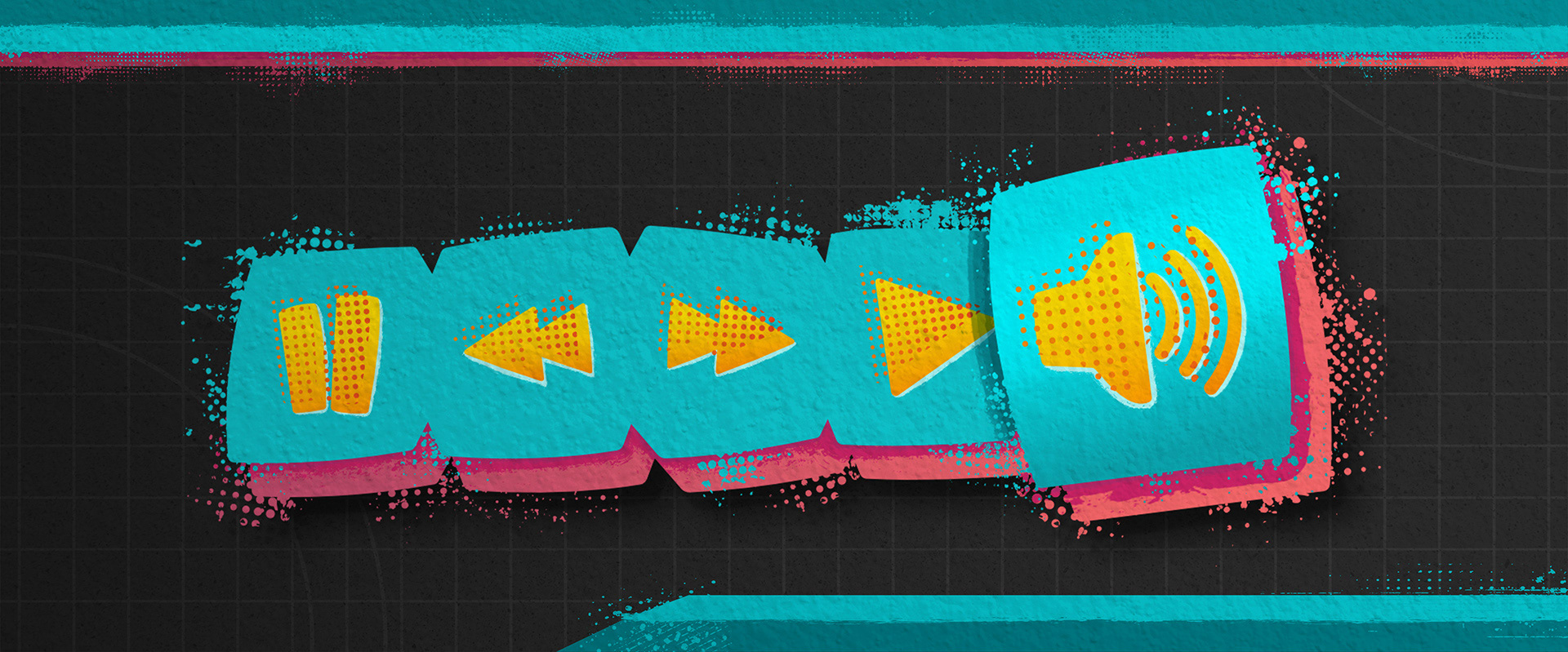
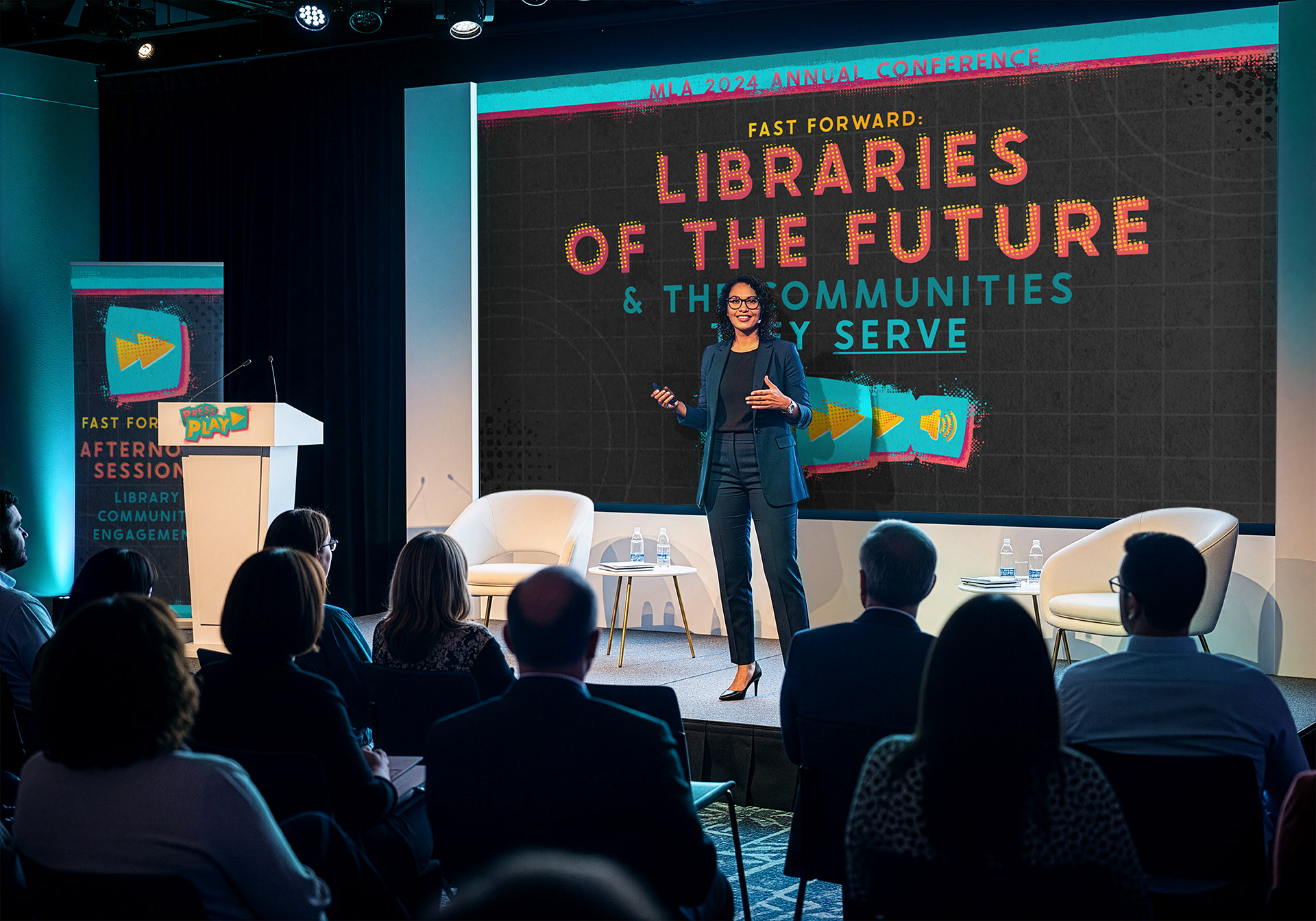
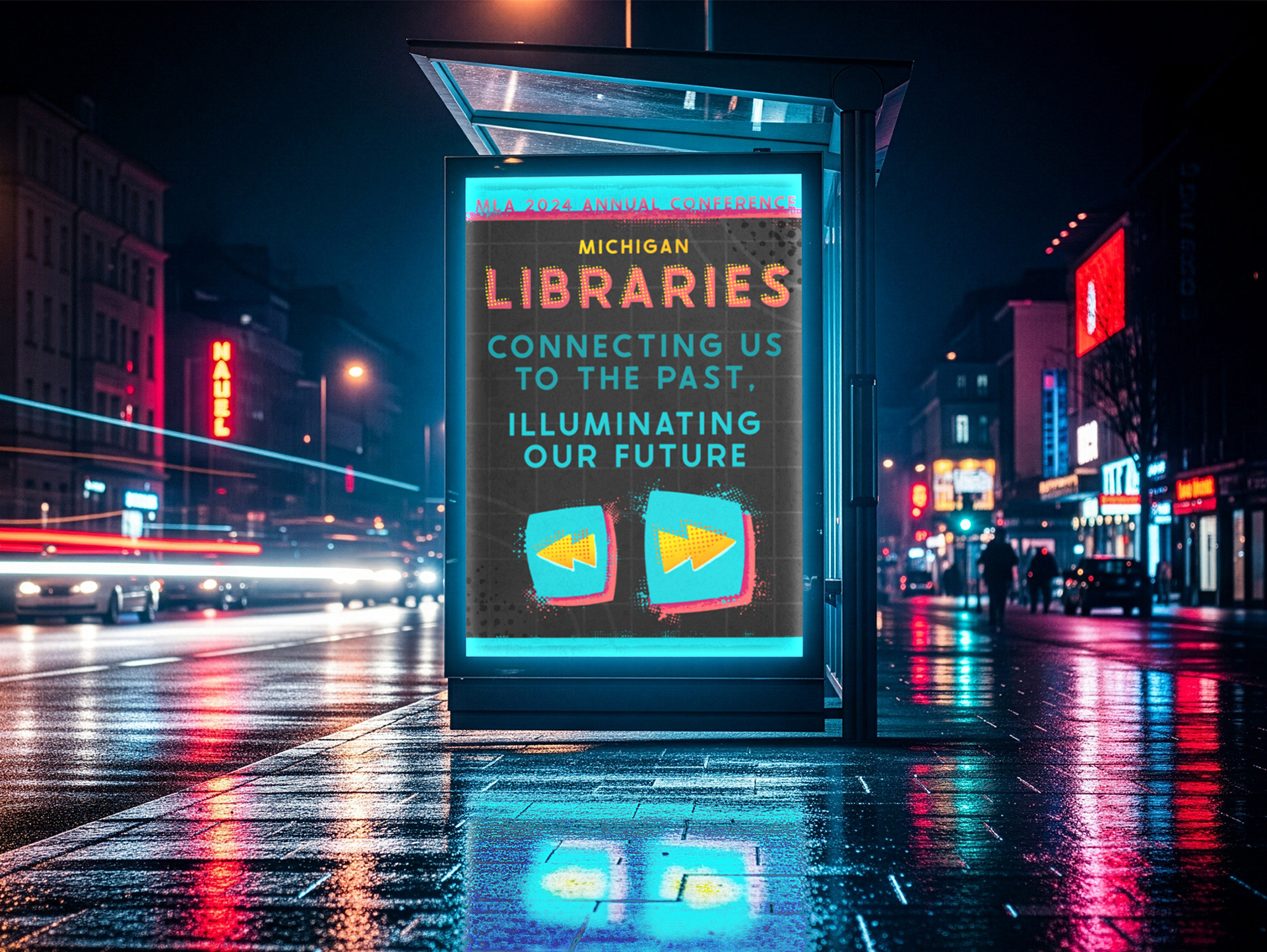
In expanding off the play button visual, we developed a series of icons inspired by the playback conrtols of boomboxes, Walkmans, and VHS players: retro fun combined with vibrant 90's colors, and a touch of texture to break the digital space.
The program tracks for the conferene would each correlate with a different button on the controls. For example, 'Pause' for reflection, 'Rewind' to connect with our past, 'Fast Forward' to illuminate our future. We even created a stylied menu graphic that could be used in presentions to signify each track (see below). Depending on the track the corresponding button would be large and loud.